Maximum Heat of the Sun in Different Stations Across Alexandria [May 1906-April 1907]
INTRODUCTION
The overall goal of this individual analysis project is to analyze a range of maximum temperatures from data taken from different stations in Alexandria, Egypt. I chose to investigate the timeline of May 1906 to April 1907 with the hopes of finding whether or not there are correlations between the temperature of each location themselves. In combination to this, I also will make inferences between why some stations are higher than others and how that can relate to how busy they are. With this in mind, I can further make inferences about foot traffic and how that affects pollution levels in more popular or less popular places, inherently affecting temperature data.
There were a couple of general questions that motivated me to focus on this topic. The general topic of my group analysis project had to do with looking at temperature change over the decades over the country of Egypt, so I knew I had to do something within those parameters. One guiding question I came up with is as follows: “Do the measures in the heat of the sun section from the ‘Daily Weather Report’ part of each issue of the newspaper flow accordingly throughout the months recorded and will this data bring about any sort of significance on other topics prevalent during this time in Alexandria?”
I take a genuine interest in climate change as a global topic in the present, so seeing how it influenced and was reported in the past was something I was excited to learn more about. After I drafted this first question, I began to make inferences about what I thought would answer the question. Recalling the historical time period of the European and American Industrial Revolution, I drafted this next sub-question:
“How do higher temperatures recorded in various stations around Alexandria change with the increase in industrialization measures? With the past two general questions in mind, I decided to combine them and some other smaller thoughts into the one big question that serves as a general guideline of the project. It is stated below: “With the investigation of the maximum temperature data taken from various issues of the Egyptian Gazette from May 1907-April 1908, what changes are clearly visible from location to location and how can these implications be discussed in a social climate?” Furthermore, let us continue the investigation by taking an interest in the XPath Query I used to find the basic data.
XPath Query
As far as the XPath Query goes, I wanted to make sure I chose a search that would funnel out all of the data I did not need, leaving me with relevant and applicable numbers. Using the entirety of the content folder from Github as the identification of sources I was searching from, I used the following query to find the maximum temperatures as recorded in different stations in Alexandria covered in issues of the Egyptian Gazette : //table//cell[contains(.,‘Max. Temp ‘)]/following-sibling::cell[1]/text(). This search will give me the results I need and exclude any irrelevant data, like minimum temperatures for example. Each issue of the Egyptian Gazette has a “Daily Weather Report” including a multitude of sources of information. Some of these sources include the “Maximum Temperatures” table, the “Minimum Temperatures” table, and more. Once I’ve restricted it to the daily weather report, I needed to restrict it further to just the heat of the sun which I did here. The last part of the query including the “text()” is something I included to leave the option open for me to further consolidate my research. Just for interest, I filled in vocabulary such as “population” and “climate” to learn more about the subject in context. But, the main usage for this part of the query is where I ended up figuring out how to search for the time period I was looking for. I got a little over 50 results from this query, which I thought was a pretty good number to work off of. Although my group and I originally decided to leave the data unrestricted because we thought a lot of tables would have holes in them, we decided to collectively and individually constrict the data to about a year’s time so we could make quick predictions about future weather reports across Egypt.
Data Visualization
After gathering the data results from Oxygen, I then exported them into an Atom file and used regular expressions to eliminate unnecessary components. After this, I continued to export the edited Atom data to a spreadsheet which was then opened in Tableau. After playing around with the design of the graph and choosing the axes, I decided to make a side bar graph to display the results I felt would be most welcoming to the individual interpreting it. The visual is below:
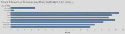
My original plan was to create a couple of graphs displaying the average temperatures in each location as recorded in the Egyptian Gazette , but while deciphering the data from Oxygen, I changed my mind. I found there were a lot of gaps in the data over the time period I chose, which was concerning. I figured it would not be a very accurate form of data if one station has way more numbers to factor in than another, which is the main reason I decided to just keep it simple and use a wholly average graph. A lot of the components of the graph had dashes instead of actual data points, which led me to believe maybe the data was inefficiently taken or there was an issue during publication of the section. If we look at the visual presented above, maximum temperatures spark during both April and July. There is a severe decrease in overall maximum temperatures in January and more obviously February. This was one of my initial predictions for the data visualization as I figured the temperature rates would be consistent with the season they were filed into.
In an overall sense, the data flows pretty well in the graph above. I do think it would have been helpful to include the graphs displaying averages per station from May 1907-April 1908, but I also think it is important to keep the data as accurate as possible. The whole idea of this project is generally looking at the effects of high temperatures in different places and how that impacted parts of society back then. A general graph supports a general idea, so I believe that “Figure 1” graph gives a good idea and supports the overarching idea of the study.
Significance of the Data
I find this subtopic particularly interesting because I take an interest in climate change presently, so I think it’s cool to look at the range between low and high temperatures in Alexandria during the time period specified. Focusing more on maximum temperatures taken at different stations in Alexandria lead to explanations dealing with problems affected by high temperatures. These can range from health problems, like maybe an increase in sickness with warmer weather or in response to pollution. A link to a published book that I found on Google Scholar, Observed Changes in Minimum and Maximum Temperature in Nile Delta, Egypt in the 20th Century, by Ebtisam Mohamed and Maged Hussein discuss the increase in temperature in the popular river throughout the 1900s. Both authors take a range of temperature samples from the Port Said location and the Cairo weather station while simultaneously running multiple statistical tests to find correlations. This article includes data on an annual scale, which is cool to look at because it corresponds with the data found in the Egyptian Gazette .
Historical Context
Similarly to other nations adopting the industrial standard in the late nineteenth century and the beginning of the twentieth century, Alexandria was no exception. An article published by Professor Bent, an instructor at the University of Oxford, discusses agrarian change throughout Egypt from 1800-1950. Although this is a super broad time period, it does include the annual range included in my data and observations. Bent concluded that the industrial revolution in Egypt earned its start towards the 1860s-1890s, and proceeded with more efficiently produced technology up until about the 1930s (Bent 4). From then on, scientists and business analysts alike researched efficient and inefficient trends in consumer behavior and the environmental impacts. I thought this study was pretty interesting to read because it advocates the interconnectedness of people and businesses, and how everything impacts the environment as a whole. In the topic of maximum temperatures, more severe changes to the environment seem to take measures according to Brent. A higher population means more pollution concentrated in an area, which will raise the overall temperature as plotted by the temperature charts. This can lead to further investigation into how the climate will change in certain areas dependent upon how many people inhabit that area.
Research Remarks
After completing the process that served as the basis for this investigation, I have learned a lot about the accuracy of data collected from the Egyptain Gazette , basic ways to interpret microfilm, and its overall importance and further implications. I feel all of these subjects are vital to understand. As far as accuracy goes, the initial holes that I found in my data when researching specific stations and dates for their data showed me that there were times errors occurred and the result was a lack in numbers. Every time this happened in an issue which I found in Atom, it decreased the general value of that specific issue and its weather section specifically. Studying past weather trends, especially in ever changing climates like Egypt, is important in giving us information to base predictions for climate change in the future. Further applicable case studies can be used in similar experimental designs to show correlations in more detailed settings, but in order to study the most trustworthy data, you need trustworthy numbers. This is not always available in the case of the Egyptian Gazette. Moving on to the actual scanning of the microfilm itself, I learned a lot about what individuals were interested back then as I performed markups on the XML documents. The advertisements paid for by the supplier taught me a lot about graphic design back in the day and market/advertising design. Using primary sources like issues from the Egyptian Gazette is extremely helpful in deciphering data from older sources. This newspaper was produced more than a century ago and is preserved, thanks to technology, until more than the next century. If computers, software, and scanning machines were not around today, then it would take a lot more work in researching and displaying the data collected for this topic. Although there are some issues with how trustworthy the data collected is, the technology used to interpret the data is very helpful in displaying it and sharing it for others to learn from or be motivated by.
Mikayla Monaco
Student
The author, a student at Florida State University, was enrolled in the digital microhistory lab in fall 2019.