Data Visualization Tutorial
Tableau is a powerful tool that can be used to view, manipulate, explore, and analyze data. For the purposes of this course, Tableau is useful to engage with the results from our Xpath queries.
Installation
Your FSU email allow you free access to Tableau’s full Desktop suite. Navigate to this page and its instructions to download your copy of Tableau. Be sure to use your FSU email address.
You will receive a download link via email. Download Tableau and follow installation instructions.
After downloading and installing the software, you can follow video tutorials to get up to speed with more advanced functions. But for now, let’s look at some simple examples using data from the digital Egyptian Gazette.
Walkthrough
First, let’s gather data to explore in Tableau. This data comes from the Coton table, which appears regularly in the financial news section of the Egyptian Gazette.
Using this query:
//table[@xml:id="deg-ta-cotn01"]//cell[contains(.,'balles')]/following-sibling::cell[1], returns the number of bales of cotton exported. Right click on the results and save to a temporary file.We will want to do more than just explore total cotton exports so let’s also run this query:
//table[@xml:id="deg-ta-cotn01"]//cell[contains(.,'Angleterre')]/following-sibling::cell[1], along with France, Russie, Autriche, Italie, Allemagne, Espagne, and other countries to acquire the cotton export numbers to each respective destination.The resulting data from each of these queries will be quite raw. We can use Regular Expressions to clean up our data before putting it into Tableau.
The spreadsheet we create from these results should contain the following variables: Month, Country, and Total Cotton Export (Bales). You can download a sample spreadsheet containing these data.
Now that we have data representing monthly total cotton exports and where they are being shipped we want to visualize this data.
Open Tableau, and click “Connect to a File” in the upper left corner, and select the spreadsheet from your hard drive.
Make sure that Tableau is recognizing the data types in your spreadsheet (dates, country names, numbers, etc). While in the Data Source interface, change the “Month” column from string to date value by Clicking on the “Abc” icon and selecting “Date” from the drop down menu. Set the “Country” column’s geographic role to “Country/Region”.
At the bottom, click Sheet 1. After dragging and dropping the “Total Cotton Export (Bales)” cell in the row slot, place the “Month” cell in the column slot, under Marks select “Bar”.
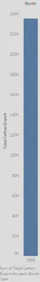
The resulting visual gives us an annual total of exports, but we can go deeper.
In the column slot, click the “Date” cell and select “Month”. This provides a clearer representation of fluctuations in the cotton export value during the year.
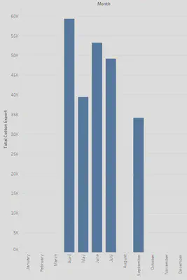
In the “Marks” box select “Label”, and click the box next to “Show Mark Labels”. Now our data is effectively communicating the monthly totals of cotton exports. Now let’s incorporate each destination to further increase the accuracy of the data.
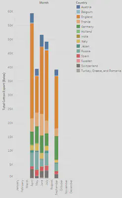
Drag and drop the “Country” cell into the Color box. Now we can see that a majority of the cotton exported every month was shipped to England.
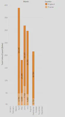
- For a simpler comparative drag and drop the “Country” cell into the Filters box, click none, then select which countries you want to compare. For now let’s look at the difference between cotton exports to England and France.
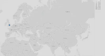
- To create a different kind of visualization clear the Columns and Rows then drag and drop the “Country” cell into the Columns slot and “Total Cotton Export” into the Rows slot. (You may need to remove the filter to display all countries). On the right hand side of the interface click “Show Me”, and select the Symbol Map option. The resulting image depicts the amount of comparative cotton exported to each location.
- To save our visualizations, click “Story”, “New Story”. Drag the desired sheet to the designated location. Click “Story”, “Export Image”.
Conclusion
Tableau is great for creating visualisations from your data, but it also is useful for data exploration. When we create data visualisations it is important to remember to keep graphics simple and self-explanatory. For independent data exploration, however, we can try simple as well as complex approaches. Experiment with your data in the software to not only create graphics, but to see how different visualisations help you think about your research.